Accessibility Button Color
The colorButton parameter allows changing the accessibility button color.
It can take one of the following three values:
- ✅ a11yColorMain
- ✅ a11yColorLight
- ✅ neutralLowMain
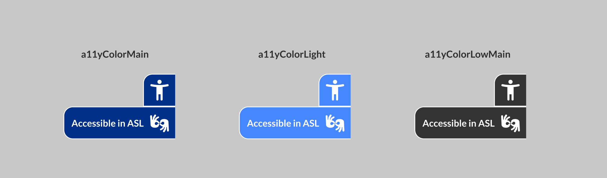
Example of Customizing the Accessibility Button Color
<body>
  <!-- Imports the latest version of the Hand Talk plugin -->
  <script src="https://plugin.handtalk.me/web/latest/handtalk.min.js"></script>
  <script>
    var ht = new HT({
      // Replace with your access token
      token: "TOKEN",
      // Example of customizing the accessibility button to light blue
      colorButton: "a11yColorLight"
    });
  </script>
</body>
When to Use Each Color
According to WCAG guidelines, the contrast between text and background should be at least 7:1 to ensure accessibility. Following this guideline:
- ✅
a11yColorMainandneutralLowMainare recommended for light backgrounds. - ✅
a11yColorLightis recommended for dark backgrounds.
Attention
Remember to check the contrast in carousel banners to ensure the button remains visible in all images.